Visualizing with Claude 3.7: A Case Study for Data Literacy
Today's post content:
10+ exercises about data presentation and basic data science vocabulary
3 dialogues/listening exercises
2 pronunciation exercises
1 video
links to Claude showing the process of how some of the visualizations were created
Paid subscribers have access to download the complete materials at the end of the post.
Claude 3.7
Learning data terms can be difficult when you only see written definitions. AI tools like the recently released Claude 3.7 now help educators and others create clear pictures that show exactly what these terms mean in practice. When you see a spike on a sales chart labeled as an "outlier" or a pie chart showing "variation," you understand these concepts immediately through your eyes, not just your brain. These visual connections help you remember terms better and recognize them when you encounter them at work. Companies now expect employees to understand data conversations, and these images provide a direct path to that understanding without requiring advanced technical knowledge.
Today’s exercises focus on some basic vocabulary, expressions and collocations used to talk about data. The first set of exercises focus on data for presentations. The second set expands a bit further into essential data science vocabulary. For the best example of what Claude 3.7 can produce, see the Data Science Fundamentals video here and the exercise below.
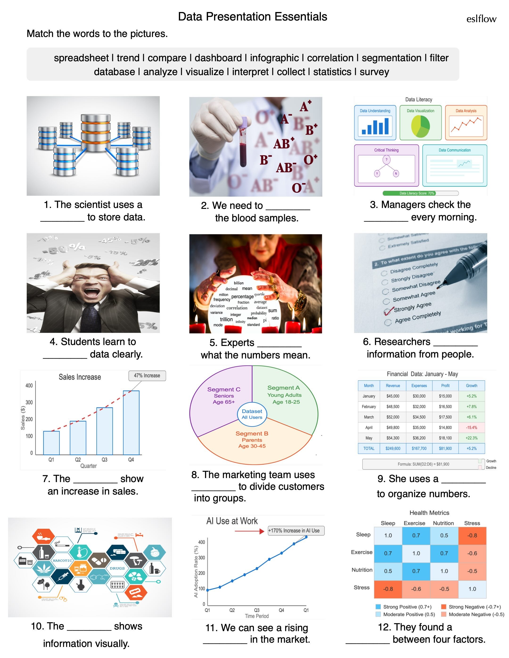
Data Presentation Vocabulary
Imagine walking into a job interview where the manager asks you to interpret their quarterly sales dashboard. Or picture yourself in a team meeting where everyone's discussing customer segmentation and market trends. Feel a little uncertainty? These twelve essential terms may help alleviate that uncertainty. They flow together in the information lifecycle—from collection to visualization.
Data Presentation Dialogue
This listening activity puts you right in the middle of a workplace conversation about data presentation. You will hear two colleagues, Zara and Mateo, discussing how to turn their spreadsheet information into something that will impress investors.
Data Presentation Collocations
Speaking about data correctly requires knowing which words naturally go together in English. Knowing that we "analyze data" rather than "observe data" helps you sound more professional and confident. These exercises guide you through choosing the right combinations, completing sentences with correct forms, fixing common errors, and forming questions about data topics.
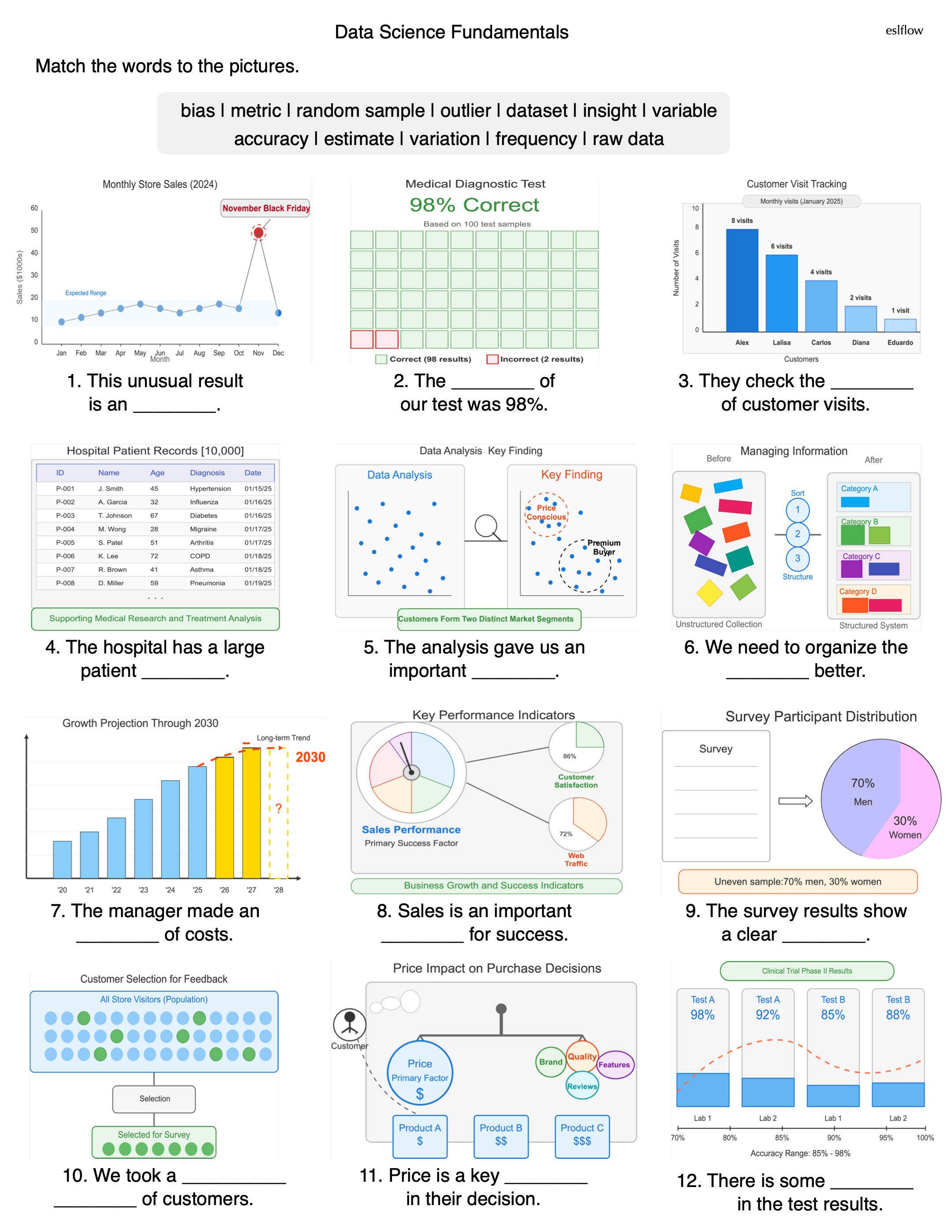
Data Science Fundamentals
For me, as someone who has been using visual techniques for teaching vocabulary and language for 30 years, Claude 3.7 is quite revelatory in its ability to create visualizations of data terminology.
The Data Science Fundamentals worksheet represents a powerful approach to teaching specialized vocabulary by connecting abstract terms directly to their visual representations in real-world contexts. This method transforms potentially intimidating data science terminology into accessible concepts that students can immediately grasp and apply.
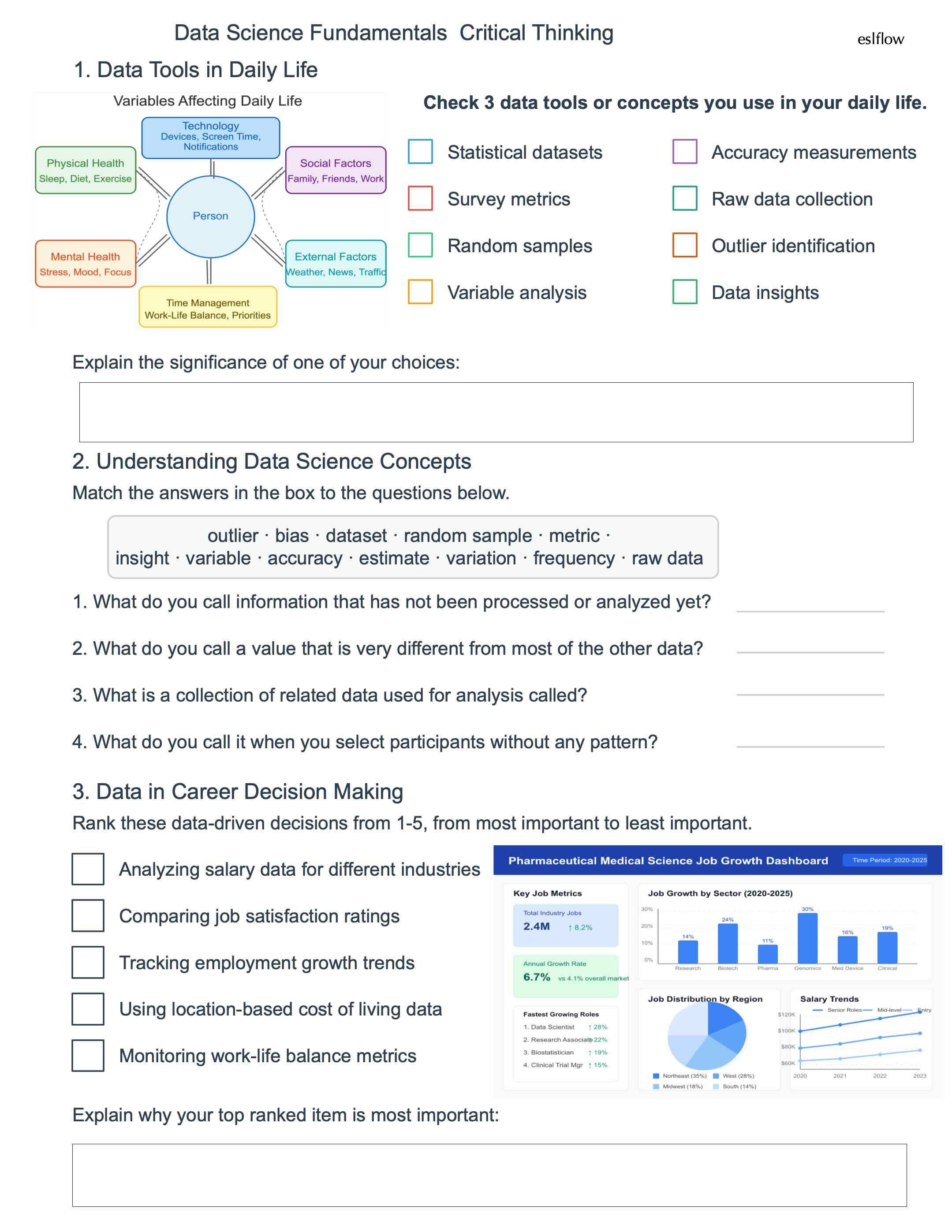
Data Science Fundamentals Critical Thinking
Data science concepts come alive when students connect them to their own experiences. Abstract terminology like "outliers" and "random samples" are transformed for academic concepts into practical tools students already use in their daily decision-making. Through personalized exercises—identifying which data tools they currently use, matching vocabulary to real-world scenarios, and ranking data-driven career decisions—students internalize these concepts through their own critical thinking. The visual elements, including the variables affecting daily life diagram, help students visualize how data science exists not just in lecture rooms and labs but in the personal choices they make every day.